
I’ll be 32 this year, and since I’ve put my foot in the door of my 30s, I have been on the hunt to try to align with the mature me, the 30s me. I’ve thrown out the majority of my wardrobe from my 20s and have been slowly rebuilding with basics, comfy jeans, and any type of natural fiber I can get my hands on. I’ve even thrown out those old mismatched pajamas for those cute sets you can find at Marshalls. I’m trying to find my personal style, something I can rely on that will never fail me.
In doing all of that, I’ve been revisiting my favorite comfort movies to help me rediscover my inner self. I believe everything starts in your childhood, so it only makes sense to go back to your origins when starting over. One of the movies that I’ve rewatched over and over again is The Devil Wears Prada. And yes, I was rewatching it long before the release of the sequel. But of course, I rewatched it again before seeing the sequel. The day The Devil Wears Prada 2 hit streaming, I was glued to my iPad mini with my noise-canceling headphones. I did not want any interruptions because this sequel featured the original cast!! Anne Hathaway, Meryl Streep, Stanley Tucci, and Emily Blunt, all icons in their own right.
Almost 2 hours later, I was feeling a ton of emotions—inspired, blissful, passionate, and invigorated. Although it wasn’t really a movie centered on fashion, I fell in love with the world of it. As many times as I’ve seen the first movie, the second movie really sparked something in me. I think it had something to do with how good of a character Miranda Priestly is. In the first movie, you can tell she is strict but passionate about her work. She knows her stuff.
When you say Miranda Priestly, the next thought can only be Anna Wintour. If you don’t know, Anna Wintour was the Editor-in-Chief of Vogue from 1988 until 2025. Now she is the Chief Content Officer of Condé Nast and Global Editorial Director of Vogue. Meryl Streep’s character, Miranda, was heavily inspired by Anna Wintour. Before the movie, there was a book by Lauren Weisberger, and there are many interviews and deep dives that discuss the origins of this movie franchise. For now, I want to get into the notes from the Vogue May 2026 issue.
I read through this issue of Vogue twice. I think my expectations were set after watching the movie, so I can honestly say I was let down a bit. I spent some time on Threads to see what people were saying about Vogue these days, and the consensus is that Vogue is not what it used to be. The stories were just okay, but I asked myself, am I deeming this issue bland because I have no history or deep knowledge of editorial fashion? Not sure. I remember reading magazines in the grocery store checkout, but they were always the gossip magazines. But those were fun to read. They had horoscopes, what’s in my bag, well-put-together collages, and fun quotes from the celebrities that I was used to seeing on TV.
I understand that an editorial fashion magazine and a gossip/celebrity magazine are in two different categories. Vogue just feels like something is missing. Maybe they are just running through the motions, or maybe they don’t have the budget like they used to. Either way, I was still able to find some things that caught my attention. So let’s get into them below!
Skylar Diggins In The Blue Saratoga Ad

This ad was beautifully done, and I love the contrast the blue gives against the white and gray background. This two-page spread is simple and creatively done. Blue is my favorite color because it’s a calming color for me, and if I could describe peace as a color, it would be blue. Based on this ad alone, I would buy Saratoga water! I did some digging on their YouTube channel, and they have a promo video from 1 year ago titled “The Art of Water.” Whoever is in charge of that water is doing a damn good job. Check the video out HERE.
Ariana Grande Swarovski Ad

You can literally see and feel the magic in this ad from Swarovski. The pastel green coloring is blended with lighting that shines down on the right side of her face. And then all of the insect jewelry looks like it just landed on her arm naturally. The hints of purple in her dress and on her gloves bring everything together. It looks and feels like a whimsical photo. The print they chose for her name also feels nostalgic. It is a beautiful ad that looks like no detail was overlooked.
The Art Of Fashion
This page is the entry point for what the whole theme of the magazine is. What moved me was the way they described the relationship between fashion and art, and how the two worlds continue to come together and elevate each other. They described the partnership as “a kind of alchemy,” which immediately caught my attention.
After reading this, I really didn’t know what to expect until I saw the next spreads. After viewing each one, I understood what they were trying to do. Some were breathtaking, others felt meh. But that could be because of me being so new to this world.
The Cartier Ad
This ad is simple but tastefully done. My only exposure to high-end jewelry is seeing Jennifer Tilly flaunt it on The Real Housewives of Beverly Hills, and I never understood why someone would want to buy these types of things. Well, this ad changed my perspective. If I hit the lottery today, this would be one of my first purchases. I love how the panthers look like they are climbing down and stepping on those stones. I browsed the website for fun and couldn’t find the exact necklace, but everything else is stunning.
The Pasquale Bruni Ad
This was another subtle but well-done ad. The model almost blends in with the forest. It almost looks like she is posed to be lying on the floor. All of the jewelry pieces are properly placed around her in a way that looks natural. It almost looks like the flowers are naturally there, just as you would walk by and see flowers growing out of the soil. I searched some of the rings that are shown, and prices start at a cool $20,000 and up. Check them out HERE.
The RVNG AD

This ad is my absolute favorite!! The image itself looks like it was painted, but if you look close enough, the models look real. The dresses are breathtaking with different textures, layers, and colors. My favorites are the yellow gown and the one-piece suit with the wrist full of feathers that flow down to her legs. I may save these images to be framed for my magazine wall! This is my first time hearing of this brand, but a quick Google search reveals that they are a couture fashion house. The founder’s name is Jordan Stewart! I’ll be following her brand because all of the gowns on her website are stunning.
The Lancome Paris Happy Mother’s Day AD
When I saw that they are still putting perfume samples in magazines, I squealed! This was the highlight of the whole magazine for me, honestly. I really enjoyed the smell of the perfume and put it on my list of future perfumes to purchase! I love a sweet, fruity, or flowery smell for a perfume, something soft and feminine, and this checked all the boxes for me.
Art is Fashion- Everything is Connected
Out of all the designers, this is the only one that stood out to me as breathtakingly beautiful. I’m not sure if it’s the “Everything Is Connected” theme or that the gown is a work of art. They have the art piece that the dress was referenced from, and it is just gorgeous. It looks like her veins have seeped through and are spilling down the gown. The designer is Olivier Theyskens, and the model is Libby Taverner. This dress reminds me of a costume that a character in a science-fiction movie could wear. It is truly so simple and a work of art!
Joy Ride
I love this image of Anna and Meryl in the back seat. Even though this is the sequel to an iconic movie, I can only imagine how Anna Wintour feels about this movie that is centered around her and her time at Vogue. And Meryl looks fun, youthful, and like she is having the time of her life. They both are showing two different personalities, but somehow they blend together really well. I enjoyed reading the interview moderated by Greta Gerwig.
The Blue Period
My favorite color and a gown that looks like a blend of a butterfly and mermaid. The pattern almost gives off an illusion that you can’t stop staring at. I love the choice of pairing this with a black turtleneck because the ballooning skirt remains the focus. Artist Tschabalala Self did an excellent job with this art piece. I would have loved to see a full spread with this look! I did a quick search on her Instagram, and she was styled by Law Roach for this look, so it all makes sense now! Bravo to her and the entire team that put this together.
The Dolce & Gabbana Pajamas

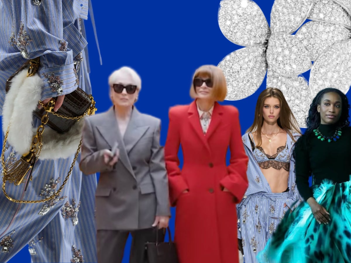
I’ve saved the best for last. If Anna Wintour told me herself that I could pick one item to have for free in this entire magazine, it would have to be these cotton striped pajamas that have been embroidered with flowers or clusters of crystals. I managed to hunt them down, and they were a part of the Spring 2026 Ready-to-Wear collection. Meryl Streep, Stanley Tucci, and Simone Ashley were there in character while filming the sequel. I remember when it hit the internet because it was confirmed that the sequel to The Devil Wears Prada was being filmed. If I could describe what I want my 30s to look like, it would be these pajamas! One day I will own a pair of these pajamas.
As always,
Brittney


Leave a Reply